A customer sent us artwork for a 9cm chest logo last month. We sampled it, and he immediately asked for a revision. The logo looked massive and distorted the fabric. I had to explain that the problem was not the factory; it was his spec. He did not understand that logo size is constrained by fabric structure and embroidery physics, not just visual preference.
Logo placement on golf polos follows three standard zones—left chest, sleeve, and back neck—with different size limits for each. Left chest typically runs 5-7cm, sleeve 3-5cm, back neck 3-4cm. These ranges are determined by fabric type, decoration method, and manufacturing constraints, not arbitrary design rules.
![]()
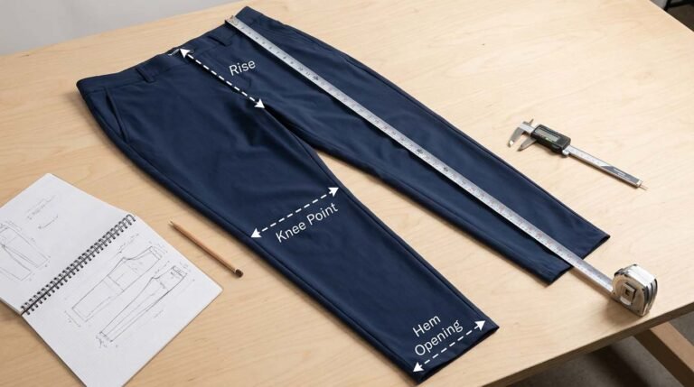
I manage production for custom golf polos, and I spend half my time correcting logo specs before sampling. Customers send artwork with one size request for all placements, or they ask for sizes that cannot physically work with their chosen fabric and decoration method. My job is to translate their brand vision into specifications that survive production without distorting, puckering, or failing after the first wash. This article walks you through the technical realities I explain to customers every week.
Quick Answers: Logo Placement Specs & Production Rules
What is the standard logo size for left chest placement?
5-7cm (width or height, whichever is larger) is the typical range. Smaller than 5cm loses detail in embroidery; larger than 7cm can distort lightweight fabrics and look disproportionate. I recommend 6cm as a safe starting point for most designs.
Can you use the same logo size on chest and sleeve?
No. Sleeve logos must be smaller—typically 3-5cm maximum. The sleeve curves and moves during wear, so larger logos distort or create stiffness. A 7cm chest logo should be paired with a 4cm sleeve logo for visual balance.
Where exactly does the left chest logo go?
The standard position is 7-9cm down from the shoulder seam and 10-12cm in from the center front (placket edge). This keeps it visible but avoids the armpit seam and placket buttons. These measurements apply to a men's medium; other sizes scale proportionally.
What is the best decoration method for performance fabrics?
Heat-transfer or silicone printing works better than embroidery on lightweight stretch fabrics (under 150 GSM). Embroidery on thin mesh or high-stretch knits causes puckering, distortion, and fabric pull. We recommend embroidery only on structured fabrics like piqué over 160 GSM.
Can you put logos on the back neck inside the collar?
Yes, but size is limited to 3-4cm maximum width. This placement is for heat-transfer labels or small embroidered logos. Anything larger interferes with collar construction and can irritate the neck. It is common for brand labels, not prominent branding.
How do you prevent embroidery from puckering the fabric?
Use proper backing (tearaway or cutaway stabilizer), reduce stitch density for lightweight fabrics, and avoid logos with tiny details that require excessive stitches. We also test samples on the actual production fabric before committing to full runs.
Do golf course dress codes restrict logo size or placement?
Most courses have no specific logo size rules, but corporate logos, sponsors, and team branding may have restrictions. Professional tour events enforce strict guidelines—typically one chest logo under 10cm² and limited sleeve branding. Always check event or corporate uniform policies before finalizing placement.
What Are the Standard Logo Zones: Left Chest, Sleeves, Back Neck and Collar?
The three standard logo zones are left chest (primary branding), sleeves (secondary branding or sponsors), and back neck (inside or outside collar for labels or small logos). Right chest, lower hem, and back center are non-standard placements used only for specific branding strategies.
![]()
Left Chest: The Primary Spot
Left chest is the most visible and traditional placement. It sits over the heart, which has symbolic and historical associations with brand loyalty and team identity. From a production standpoint, it is also the easiest area to decorate—it is a flat, stable panel of fabric with minimal stretch or movement.
The left chest position is measured from two reference points: down from the shoulder seam and in from the center front (placket or center seam). A typical men's medium uses 7-9cm down and 10-12cm in. Women's polos adjust slightly higher and more centered to account for bust curvature. These measurements ensure the logo sits in the visual center of the chest panel without overlapping the armpit seam, placket, or collar.
Sleeve: Secondary Branding
Sleeve logos are common for sponsor branding, team numbers, or additional brand marks. The two typical placements are upper sleeve (near the shoulder seam) or mid-sleeve (around the bicep). Upper sleeve (3-4cm from the shoulder seam) is more visible and traditional. Mid-sleeve can be used for larger graphics but risks looking busy.
The sleeve is a curved, mobile surface. During the golf swing, the fabric stretches and rotates. This movement constrains logo size and complexity. A logo that looks fine on a flat sleeve can distort into an oval or twist when the arm moves. I always recommend testing sleeve placement on a worn sample, not just a flat garment.
Back Neck: Labels and Small Logos
Back neck placement has two options: inside the collar (like a woven label) or on the outside, just below the collar band. Inside placement is for care labels, size tags, or discreet brand logos—typically 3-4cm wide maximum. Outside placement can be slightly larger (up to 5cm) and is used for prominent branding on some performance lines.
I see customers request large back neck logos without realizing the collar construction limits what fits. The collar band curves around the neck, and the fabric there is often reinforced with interfacing. Oversized logos can create lumps, discomfort, or collar distortion. Keep back neck logos small and simple.
What Are the Size and Placement Specs: Dimensions, Clearances and Scaling?
Logo sizing must account for decoration method limits, fabric behavior, and visual proportion. Left chest logos at 5-7cm, sleeve at 3-5cm, back neck at 3-4cm are not design suggestions—they are the ranges where most fabrics and decoration methods deliver clean, stable results without revision.
![]()
Left Chest: 5-7cm Standard
Here is why this range works from a manufacturing perspective:
- Under 5cm: Embroidery detail gets lost. Small text becomes illegible. The logo looks too small on most body sizes. We can go smaller, but expect simplified artwork and potential readability issues.
- 5-7cm: The sweet spot. Embroidery machines can render detail clearly. The logo is proportional to the chest panel on sizes S-XL. Fabric distortion is minimal with proper backing.
- Over 7cm: The logo starts dominating the chest. On lightweight fabrics (under 150 GSM), the embroidery weight causes visible puckering. The stitch count increases, raising cost and production time. On larger sizes (XXL+), it can work, but you need to test.
Positioning is just as important. From the shoulder seam down to the logo center, I use 10-12cm for men's medium. From the placket edge to the logo center, I use 11-13cm. These measurements keep the logo in the "safe zone"—away from seams, buttons, and the armpit where fabric pulls during movement.
Sleeve: 3-5cm, Closer to Shoulder
Sleeve logos must be smaller than chest for two reasons: visual balance and fabric behavior. A 7cm sleeve logo next to a 7cm chest logo creates visual confusion—the viewer does not know where to look. A 4cm sleeve logo subordinates to the 6cm chest logo, creating a clear hierarchy.
The second reason is technical. Sleeve fabric is under constant tension during arm movement. A large, densely stitched embroidered logo resists this movement, creating stiffness and discomfort. It can also cause the fabric to pucker permanently. For sleeves, I often recommend heat-transfer or silicone print instead of embroidery, especially on performance stretch fabrics.
Placement: 3-5cm down from the shoulder seam, centered on the sleeve panel. This keeps it visible without riding up into the armpit or sliding down toward the elbow.
Back Neck: 3-4cm, Limited by Collar
Back neck is the most constrained placement. Inside the collar, you have maybe 8-10cm of usable width before you hit the collar seams. A 3-4cm logo leaves clearance on both sides. On the outside, below the collar, you have slightly more room, but the fabric curves and any oversized logo will create a hump.
I see customers request 6cm back neck logos and then complain when the collar does not sit flat. This is a physics problem, not a quality issue. Keep it small.
Scaling Across Sizes
Here is a critical point customers miss: logo size should scale with garment size, but not proportionally. A 6cm chest logo on a medium might become 6.5cm on an XL and 5.5cm on a small. If you keep the same absolute size across all sizes, the logo looks too big on small sizes and too small on XXL.
I create a scaling chart for each project:
| Garment Size | Left Chest (cm) | Sleeve (cm) | Back Neck (cm) |
|---|---|---|---|
| S | 5.5 | 3.5 | 3.0 |
| M | 6.0 | 4.0 | 3.5 |
| L | 6.5 | 4.0 | 3.5 |
| XL | 6.5 | 4.5 | 4.0 |
| XXL | 7.0 | 4.5 | 4.0 |
This ensures visual consistency across the size run.
What Decoration Method Should You Use: Embroidery, Heat-Transfer or Print?
Embroidery works best on structured fabrics over 160 GSM. Heat-transfer (TPU, silicone) is better for lightweight and stretch fabrics. Screen print is for large graphics but has durability issues. Your fabric type determines your decoration method, not the reverse.

When to Use Embroidery
Embroidery is the traditional, premium-looking option. It is durable, has a 3D texture, and holds up well to washing. But it requires the fabric to support the weight and tension of thousands of stitches.
I recommend embroidery for:
- Piqué fabrics over 160 GSM
- Standard polo knits over 150 GSM
- Cotton blends with stable structure
I advise against embroidery for:
- Mesh fabrics under 140 GSM (will pucker)
- High-stretch performance knits (embroidery resists stretch, creates stiffness)
- Lightweight jerseys under 130 GSM (will distort)
When to Use Heat-Transfer or Silicone
Heat-transfer logos (also called TPU or silicone printing) are applied with heat and pressure. They sit on top of the fabric rather than stitching through it. This eliminates puckering and allows the fabric to stretch naturally.
I recommend heat-transfer for:
- Performance stretch fabrics (15%+ elastane)
- Mesh and eyelet knits under 150 GSM
- Sleeve logos on any stretch fabric
- Any application where you need a smooth, flat finish
The downside is durability. Heat-transfer logos can peel or crack after many washes, especially if exposed to high heat in the dryer. I tell customers to expect 50-100 washes before noticeable wear, compared to 200+ for embroidery.
When to Use Screen Print
Screen printing is rare on small logos but common for large back graphics or all-over prints. It is cost-effective for high-volume runs but has the poorest durability. The ink sits on the fabric surface and can crack or fade.
I only recommend screen print for:
- Large decorative graphics (over 20cm)
- High-volume orders (500+ pieces) where cost per unit is critical
- Designs where a vintage, distressed look is acceptable
How Do Compliance and Etiquette Rules Affect Logo Placement?
Private clubs, professional tours, and corporate uniform policies often restrict logo size, placement, and quantity. Standard rules limit chest logos to 10cm² or smaller and prohibit multiple prominent logos. Always confirm compliance requirements before finalizing artwork.

Club and Course Rules
Most public courses have no logo restrictions. You can wear any branded polo as long as it has a collar. Private clubs are stricter. Common rules include:
- One logo on the chest, maximum 10cm² (roughly 3cm x 3cm)
- Sleeve logos must be smaller than chest
- No logos on the back visible during play
- No offensive or inappropriate imagery
These rules exist to maintain a "clean" aesthetic and prevent courses from looking like advertising billboards. I tell customers: if your target market plays at private clubs, keep logos conservative.
Professional Tour Standards
If your brand sponsors professional golfers or sells to competitive players, you need to follow tour guidelines. The PGA Tour, LPGA, and European Tour have detailed rules:
- One manufacturer logo on the chest (typically 5-6cm)
- Up to four additional sponsor logos (sleeves, collar, back)
- Strict size and placement restrictions
- Approval required for new placements
These rules are enforced, and violations can result in fines or disqualification. Even if your customer is not playing in a tour event, mimicking tour-compliant placement signals professionalism and respect for the sport.
Corporate Uniform Policies
Companies ordering custom golf polos for employee uniforms often have internal branding guidelines. Common requirements:
- Company logo on left chest, specific size
- No personal logos or branding
- Consistent placement across all sizes
- Matching color and style across departments
When I handle corporate orders, I always ask for their brand guidelines document upfront. This saves revision cycles.
What Do You Need for Production Prep: Artwork, Digitizing and Color Matching?
Clean artwork is the foundation of successful logo production. Vector files (AI, EPS) are required for embroidery digitizing. Thread color matching requires Pantone codes, not screen colors. Failing to provide proper artwork files causes delays, added costs, and poor results.
![]()
Artwork File Requirements
For embroidery, we need a vector file—a graphic built from mathematical curves (like Adobe Illustrator files) rather than pixels (like JPG or PNG). Vector files can scale infinitely without losing detail. We use these to create the embroidery "digitizing" file—the instructions that tell the embroidery machine where to place every stitch.
If you only have a raster file (JPG, PNG), we can sometimes convert it, but complex logos with gradients, fine text, or intricate details will lose quality. I always request source files from customers: the original Illustrator, CorelDRAW, or PDF file their designer created.
Digitizing: Turning Art into Stitches
Digitizing is the process of converting a graphic into a stitch file. This is not automatic—a skilled digitizer must decide stitch type (fill, satin, running), stitch direction, density, and underlay (supporting stitches beneath the main design).
Poor digitizing causes most embroidery quality problems:
- Too many stitches: fabric puckers
- Too few stitches: logo looks sparse and cheap
- Wrong stitch direction: logo distorts during washing
- No underlay: logo looks loose and shifts
I work with digitizers who understand golf polo fabrics. They adjust stitch density based on fabric weight. A 180 GSM piqué can handle higher density than a 150 GSM jersey.
Thread Color Matching
Customers send me logos with colors like "red" or "blue" without specifying the exact shade. We then sample it, and they say "that is not the right red." This happens because screen colors do not match thread colors.
Thread manufacturers use Pantone color codes or proprietary color systems. I ask customers for Pantone references or physical thread samples. If they cannot provide these, I send them a thread color card and have them select the closest match before production. This eliminates back-and-forth on color approval.
Stitch Count and Backing
Stitch count determines cost and production time. A simple logo might have 5,000 stitches; a complex one could have 20,000. Higher stitch counts mean longer machine time and higher cost per unit.
Backing (also called stabilizer) is the material we place behind the fabric during embroidery to prevent puckering. Three types:
- Tearaway: Used for stable fabrics like piqué. We tear it off after embroidery.
- Cutaway: Used for stretch fabrics. It stays permanently behind the logo for support.
- Washaway: Used for delicate fabrics. It dissolves in water after embroidery.
Choosing the wrong backing causes problems. Tearaway on a stretch polo will allow the logo to distort. No backing at all—which I have seen customers request to save cost—guarantees a failed product.
What Are the Pro Tips: Visibility, Comfort and Common Mistakes?
The biggest production mistakes I see are oversizing logos, using embroidery on incompatible fabrics, failing to scale across garment sizes, and requesting multiple large logos that compete visually and add uncomfortable weight. Keep it simple, test samples in actual wear conditions, and prioritize one primary logo placement.
![]()
Common Mistakes to Avoid
Mistake 1: Same Logo Size for All Placements
Customers specify "7cm logo" and expect it to work on chest, sleeve, and back neck. This creates visual and technical problems. Chest should always be the largest, sleeve smaller, back neck smallest.
Mistake 2: Ignoring Fabric Constraints
Requesting embroidery on a 120 GSM mesh fabric guarantees failure. The fabric cannot support the stitch density. Always match decoration method to fabric type first, then choose size.
Mistake 3: No Scaling Across Sizes
Using a 6cm logo on a size Small and the same 6cm on XXL creates proportion issues. Small looks over-branded; XXL looks under-branded. Scale your logo specs by size.
Mistake 4: Complex Artwork at Small Size
Logos with fine text, gradients, or intricate details do not translate well to embroidery under 5cm. Simplify artwork or increase size.
Mistake 5: Multiple Large Logos
More logos do not mean better branding. They add weight, stiffness, and production cost. Focus on one primary placement.
Testing and Sampling
I always recommend a pre-production sample on the actual fabric you will use for production. Do not approve artwork based on a digital mockup. Test the sample by wearing it, washing it, and moving through a golf swing motion. This catches issues before you commit to a full production run.
Conclusion
Logo placement is a manufacturing constraint problem, not a creative design exercise. Specify sizes based on fabric type and decoration method limits. Left chest 5-7cm, sleeve 3-5cm, back neck 3-4cm. Test samples in real wear conditions, and avoid the temptation to over-brand. Clean, simple placement always performs better.