
A client sent me their brand deck with a beautiful mood board featuring sunset gradients, coral pinks, and seafoam greens. They said these colors "represent our brand's energy and coastal lifestyle positioning." I asked three questions: (1) Who is buying your golf polos—30-year-old recreational golfers or 55-year-old country club members? (2) Where will they see your product first—on Instagram or in a pro shop display? (3) What is your first order budget and timeline? Their answers: primarily 45-60 age group buying through pro shops, $8,000 budget, 8-week timeline. Those answers eliminated their entire mood board. Sunset gradients require sublimation printing with 20-30% cost premium and 2-week lead time extension. Coral pink and seafoam green carry high inventory risk with conservative golf demographics. We pivoted to navy, charcoal, and burgundy with coastal-themed logo and packaging creating brand identity without color risk.
Golf apparel color selection success depends on filtering brand aesthetic preferences through three practical constraints—target customer color conservatism, sales channel display conditions, and supply chain realities of fabric availability, MOQs, and lead times—ensuring chosen colors support rather than undermine business viability.
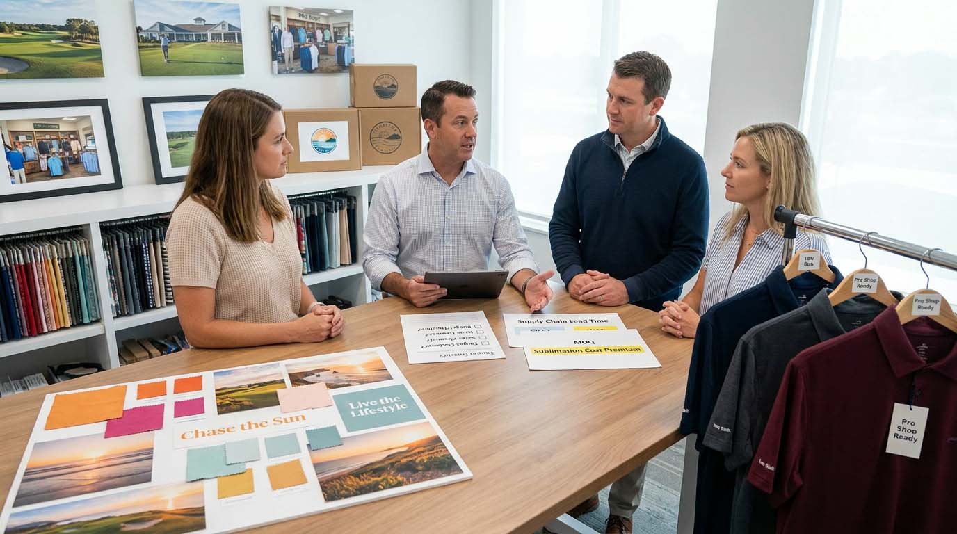
I am Will from FUWAY. I handle 60-80 brand color consultations annually during OEM/ODM project intake. Most new golf apparel brands arrive with Pinterest boards, competitor screenshots, and strong opinions about colors representing their identity. Half of these initial color schemes fail when we discuss production constraints, customer demographics, or inventory risk. My role is asking the clarifying questions that reveal whether a color choice serves their actual business model or just looks good in concept. This guide shows you how to make color decisions that survive the transition from brand deck to manufacturing reality.
Quick Answers: Golf Apparel Color Matching and Brand Identity
How many colors should I launch with for my first golf apparel collection?
For brands with under $10,000 first order budget: 3-4 colors maximum—2 safe classics (navy/black/white/charcoal) generating 60-70% of sales, 1-2 accent colors aligned with brand positioning. Each additional color requires 200-500 piece MOQ creating inventory risk. Brands launching with 6-8 colors frequently face cash flow problems from unsold accent colors requiring markdowns. Start focused, expand after validating demand.
Should I use Pantone color standards or can I just send photo references?
Pantone TCX (textile) codes are required for consistent color communication. Photos vary dramatically based on lighting, screen calibration, and camera settings—same garment photographed in daylight versus indoor lighting looks like different colors. Without Pantone reference, factory interprets your color intention differently, lab dips get rejected multiple times, timeline extends 2-3 weeks. One-time $200-300 Pantone TCX swatch book investment eliminates color guessing across all future orders.
How closely will bulk production match my approved color sample?
Industry standard color tolerance: 0.5-1 shade difference under controlled lighting conditions (Delta E 1.0-2.0 in lab measurement). Slight dye lot variance is normal and unavoidable in textile production. Colors within this range are considered matching. Differences of 2+ shades indicate production problem requiring correction. Clients expecting perfect identical match to sample will be disappointed—textile dyeing has inherent variance that approved tolerances account for.
Do certain colors cost more to produce than others?
Standard colors (navy, black, white, grey, red, royal blue) have similar costs—fabrics readily available, standard dye processes. Custom colors requiring special dye formulation add $0.40-1.20 per unit and 1-2 weeks lead time. Very light colors (pastels) or very bright colors (neon, electric) may require additional dyeing processes adding cost. Metallic or specialty finishes add $2-4 per unit. Black and navy are consistently lowest cost due to high fabric availability.
How do I ensure my logo and brand colors match across different fabric types?
Same Pantone color appears different on different fabric substypes—polyester versus cotton, woven versus knit, matte versus sheen finish. You need separate lab dip approvals for each fabric type in your collection. Embroidery thread, screen print ink, and heat transfer vinyl also require separate color matching to your Pantone standard. Expect 3-5 business days for lab dip approval per fabric/application type. Colors cannot perfectly match across all materials—approve acceptable variance range.
What colors work best for golf apparel in different regions and climates?
No universal "best" colors—regional preferences vary significantly. US market: Navy, white, black, grey dominate (65% of volume); accent colors like burgundy, forest green, slate blue perform well (25%); bright colors limited (10%). European market: More color adventurous—brighter blues, greens acceptable. Asian markets: White and light colors dominate for heat reflection; black less popular in hot climates. Southern US/tropical regions: Lighter colors preferred; dark colors perceived as too hot. Consider target market demographics and climate when allocating color assortment.
How do I plan seasonal color releases without creating too many SKUs?
Core colors (navy, black, white, charcoal): Year-round availability, replenish inventory continuously. Seasonal accent colors: Rotate 1-2 new colors per season (Spring: lighter blues, greens; Fall: deeper burgundy, forest green; Summer: lighter neutrals). Limit seasonal colors to 200-300 piece orders testing market response. Discontinue poor-performing seasonal colors after one season. This strategy maintains brand freshness (new colors each season) while controlling inventory risk (shallow depth on trend colors).
What Questions Actually Reveal Your Brand Color Needs Versus Aesthetic Preferences?
Brand color alignment requires identifying the specific customer decision moment where color influences purchase behavior—retail shelf selection, online product browsing, social media impression, or golf course visibility—because each context prioritizes different color attributes over aesthetic cohesion.
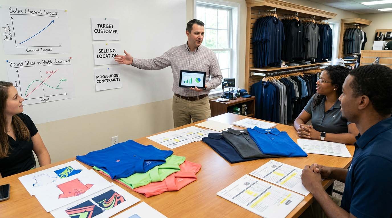
The Wrong Question: "What Colors Represent My Brand?"
What clients typically say:
"Our brand is about energy and innovation, so we want bold, vibrant colors"
"We're premium and classic, so we need sophisticated neutrals"
"We represent coastal lifestyle, so we want ocean-inspired blues and greens"
Why this approach creates problems:
Brand aesthetic preferences do not account for customer color conservatism
"Bold and vibrant" may alienate conservative golf demographics generating 70% of volume
"Sophisticated neutrals" may lack differentiation in crowded market
"Ocean-inspired blues" may not align with actual fabric availability and lead times
The Right Questions: Customer, Context, and Constraints
Question 1: Who makes the purchase decision and what are they optimizing for?
If 50-year-old golfer buying for themselves: Conservative color preferences (navy, black, grey dominate)
If 30-year-old buying gift for golf-playing parent: May choose safe colors to avoid risk
If pro shop buyer stocking inventory: Prioritizes proven sellers, avoids risky fashion colors
If direct-to-consumer through Instagram: Can test bolder colors with smaller batches
Question 2: Where does color influence the purchase decision?
Pro shop retail display: Colors compete with 20-30 other brands; need differentiation or safe familiarity
E-commerce product page: Color accuracy and variety matter; customer cannot touch/see in person
Golf course visibility: High-visibility colors may appeal to some segments, look unprofessional to others
Social media content: Colors need to photograph well and stand out in feed
Question 3: What are your supply chain and inventory constraints?
Budget under $8,000: Limits to 3-4 colors maximum due to MOQ requirements per color
Timeline under 8 weeks: Limits to standard fabric colors readily available
First order testing market: Should prioritize proven color sellers over risky fashion colors
Reorder frequency: Core colors need deep inventory; accent colors need shallow inventory
Real Client Scenario: How Questions Changed Color Strategy
Initial request:
Brand targeting "modern, athletic golfers age 25-40" wanted bright royal blue, lime green, and coral pink representing "energy and performance"
Clarifying questions revealed:
- Primary sales channel: Country club pro shops (not direct-to-consumer)
- Actual buyer demographic: Pro shop managers ordering for members age 45-65
- First order budget: $6,500 (500 pieces total)
- Reorder plan: Quarterly restocking if initial order successful
Reality check:
Pro shop buyers will not stock lime green and coral pink for conservative membership
Budget only supports 3 colors at 170 pieces each—high inventory risk if colors do not sell
Need proven sellers for reorder success, not trend experimentation
Final color strategy:
Navy (250 pieces)—safe volume driver
Charcoal grey (150 pieces)—versatile neutral
Royal blue (100 pieces)—brand accent color testing bolder direction
Saved lime green and coral pink for potential future direct-to-consumer line after validating pro shop channel
This strategy matched brand identity (royal blue accent preserving "modern athletic" positioning) while aligning with actual customer base and sales channel reality.
How Do You Build a Workable Color Palette That Balances Brand Vision and Commercial Reality?
Color palette viability depends on matching SKU count to realistic sales velocity and working capital—because each additional color creates inventory carrying costs and markdown risk that must be offset by incremental sales, making SKU discipline more valuable than color variety for emerging brands.
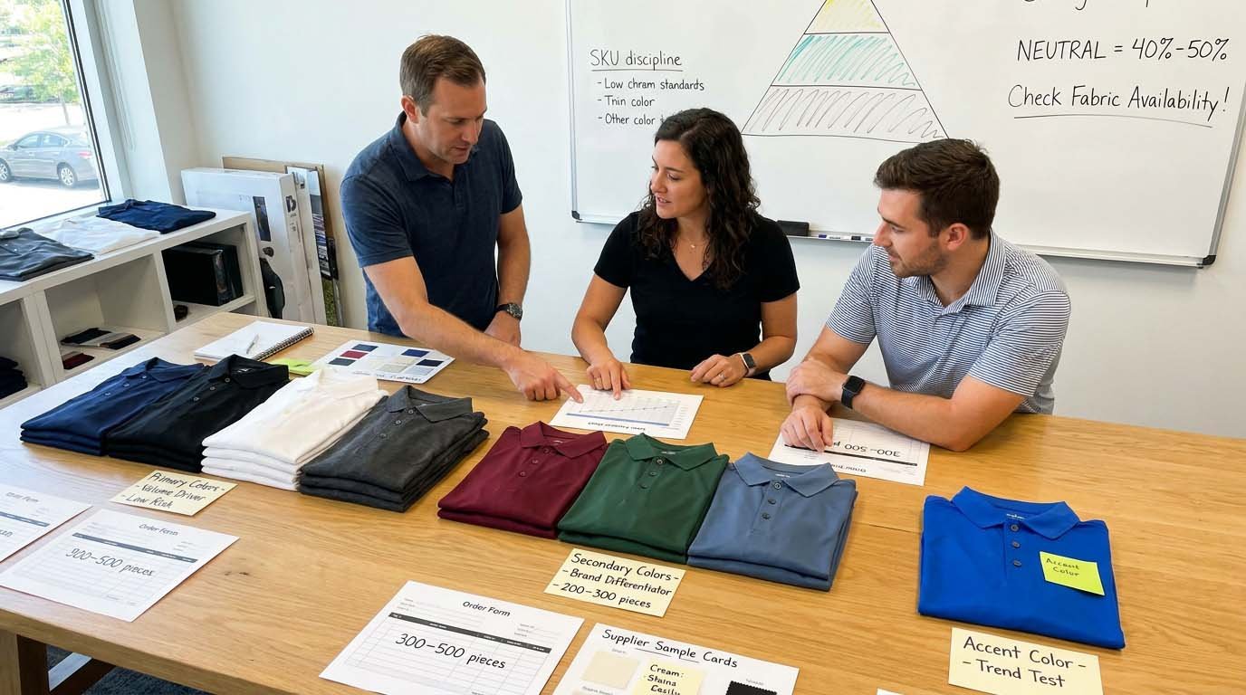
Color Palette Architecture: Primary, Secondary, Accent
Primary colors (60-70% of volume):
Purpose: Volume drivers, lowest inventory risk, consistent replenishment
Typical choices: Navy, black, white, charcoal grey
Allocation: 2 colors for brands under $15,000 first order
Order depth: 300-500 pieces per color
Reorder frequency: Every 4-8 weeks as needed
Why primary colors matter:
Generate cash flow funding accent color experiments
Provide wardrobe versatility customers expect
Lowest production cost due to fabric availability
Fastest lead times for replenishment
Secondary colors (20-25% of volume):
Purpose: Brand differentiation without high risk
Typical choices: Burgundy, forest green, slate blue, khaki—muted accent colors with broad appeal
Allocation: 1-2 colors for emerging brands
Order depth: 200-300 pieces per color
Reorder frequency: Seasonal or as proven
Why secondary colors matter:
Balance familiarity with differentiation
Appeal to customers wanting "not basic but not bold"
Reasonable inventory risk with 60-70% sell-through rates
Support premium pricing positioning
Accent colors (10-15% of volume):
Purpose: Brand personality expression, trend testing
Typical choices: Brand-specific colors, seasonal colors, fashion colors
Allocation: 1 color initially, expand if proven
Order depth: 150-250 pieces
Reorder frequency: Rarely—typically seasonal drops
Why accent colors matter:
Create visual interest and brand recognition
Test market response to bolder directions
Generate social media content and brand storytelling
Acceptable markdown risk at shallow inventory depth
Neutral Foundation Requirement
Why you need neutral anchors:
Customers buy multiple polos—need colors that coordinate with existing wardrobe
Golf dress codes at many clubs restrict bright colors
Neutrals provide safe purchase decision reducing return rates
Neutrals photograph consistently across lighting conditions for e-commerce
Minimum neutral requirement:
1 true neutral (navy, black, white, or charcoal) representing 40-50% of first order volume
Common mistake:
Brands skip neutrals entirely pursuing differentiation—then discover customers want basics not just statement pieces
Color Harmony Versus Production Reality
Aesthetic color theory says:
Choose colors that look harmonious together (complementary, analogous, triadic schemes)
Production reality says:
Choose colors with compatible fabric availability, similar dyeing processes, and aligned MOQ requirements
Real decision criteria:
Do all chosen colors exist in your preferred fabric type from available suppliers?
Can factory achieve all colors within standard lead time or do some require special dye orders?
Do all colors have similar production costs or do some add significant premiums?
Can you meet MOQ for each color or do some require larger commitments than your budget supports?
Client scenario:
Wanted seafoam green, coral, and cream "coastal palette." Factory feedback: seafoam and coral require custom dye formulation ($0.80 per unit premium, 2-week lead time), cream shows soil easily causing customer complaints. Alternative: sage green (standard dye, readily available), burgundy (standard dye, hides soil better), white (standard). Similar aesthetic feel, better production and user experience.
How Do Color Specifications Translate to Actual Fabric, Dyes, and Trim Matching?
Color specification translation requires understanding that single Pantone code represents different physical colors across fabric types, dyeing methods, and application techniques—making fabric and construction decisions inseparable from color decisions rather than sequential steps.
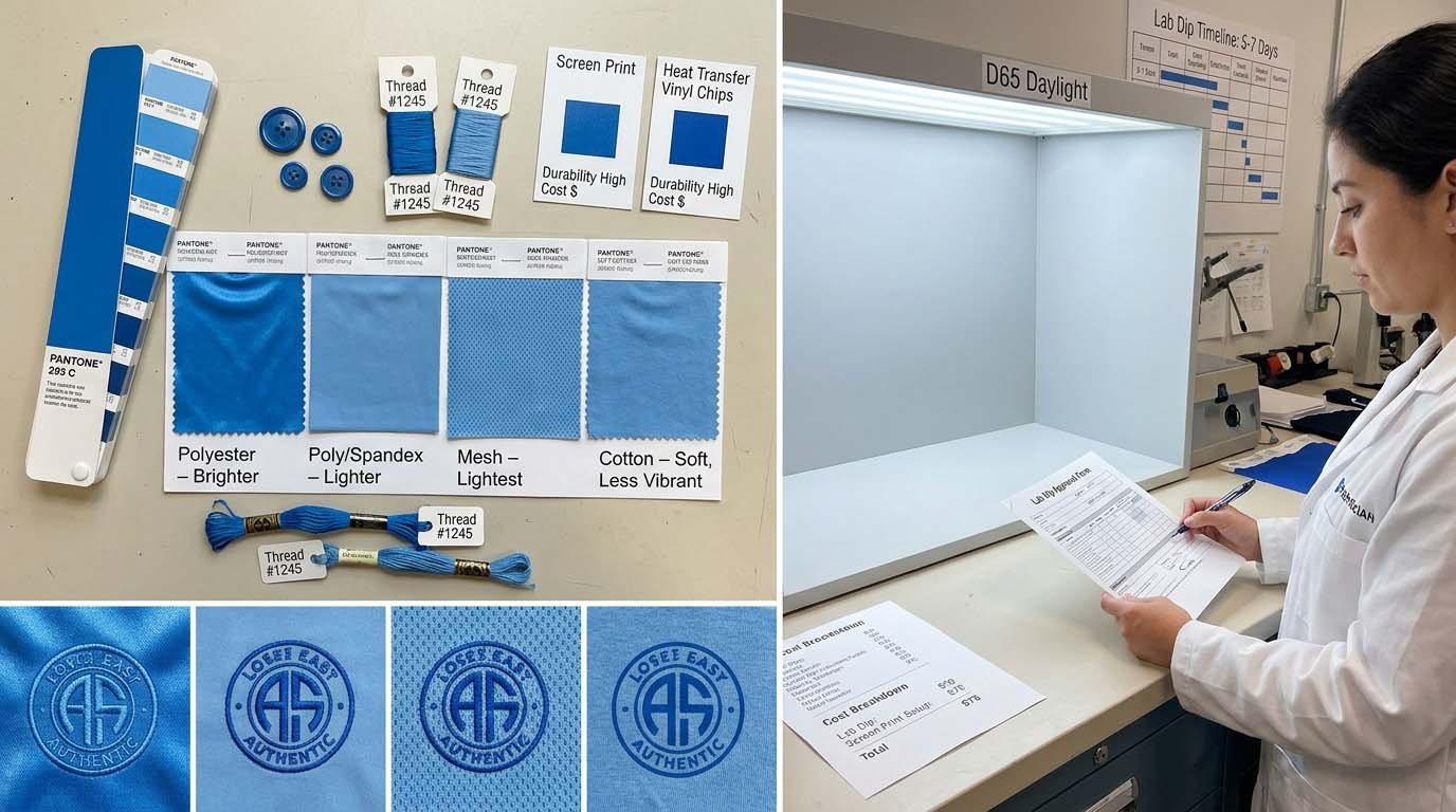
Fabric Type Affects Color Appearance
Polyester knit (most common golf polo fabric):
Color characteristics: Slightly sheen finish affects light reflection, colors appear slightly brighter
Dye method: Disperse dye—stable and colorfast
Pantone matching: Good consistency across dye lots
Polyester/spandex blend (stretch fabric):
Color characteristics: Spandex content (5-10%) affects dye uptake, colors may appear slightly lighter
Dye method: Disperse dye with careful temperature control
Pantone matching: Slightly less consistent than 100% polyester—spandex takes dye differently
Polyester mesh (for ventilation panels):
Color characteristics: Open knit structure affects light reflection and color depth perception
Dye method: Same disperse dye but color appears lighter due to structure
Pantone matching: Requires separate lab dip—will not match solid fabric even with identical dye formula
Cotton or cotton-blend (less common for performance golf):
Color characteristics: Matte finish, colors appear softer/less vibrant than polyester
Dye method: Reactive dye—different chemistry from polyester
Pantone matching: More dye lot variance than polyester, requires stricter tolerance specification
Lab Dip Process for Each Fabric
What is a lab dip:
Small fabric swatch (10cm × 10cm) dyed using proposed production dye formula, sent for your approval before bulk fabric dyeing
Why you need separate lab dips:
Main body fabric (polyester pique): Baseline color standard
Collar/cuff ribbing (if different fabric): Separate dye process required
Mesh panels (if included): Different structure affects color appearance
Contrast fabric (if used for details): Separate approval needed
Timeline implications:
Each lab dip round requires 5-7 business days (dyeing, shipping, your review)
If you need 3 fabric types, minimum 2-3 weeks for color approvals assuming first round approval
If revisions needed, add 5-7 days per revision round
Cost considerations:
Most factories include 1-2 lab dip rounds in sampling
Additional rounds may incur $30-60 fees
Excessive lab dip rounds (4+) indicate unclear color specification or unrealistic expectations
Logo and Branding Color Matching
Embroidery thread matching:
Material: Polyester or rayon thread
Color matching: Thread manufacturers have limited color ranges—exact Pantone match may not exist
Practical approach: Select closest available thread color within 0.5-1 shade
Alternative: Use contrasting color intentionally rather than attempting imperfect match
Screen printing ink matching:
Material: Plastisol or water-based ink
Color matching: Can achieve precise Pantone matches through ink mixing
Limitations: Ink sits on surface—may crack or fade after repeated washing
Durability: 30-50 washes before visible degradation
Heat transfer vinyl matching:
Material: PVC or polyurethane film
Color matching: Limited color range—standard colors only, custom colors require high MOQ
Durability: Good (50-100 washes) but can peel at edges if quality poor
Client decision implications:
If logo color must precisely match fabric color: embroidery offers best consistency but limited color range
If durability is priority: embroidery most durable, heat transfer moderate, screen print least durable
If cost is priority: screen print cheapest ($0.40-0.80), embroidery moderate ($1.20-2.00), heat transfer moderate ($0.80-1.40)
Trim Color Coordination
Buttons:
Standard colors: White, black, navy, grey readily available
Custom colors: Require button dyeing, MOQ typically 2,000-5,000 buttons, add 2-3 weeks lead time
Practical approach: Use standard button colors unless brand identity critically depends on custom
Labels and tags:
Woven labels: Can achieve most colors through weaving process
Printed labels: Full color capability
Hang tags: Full color printing available
Color matching: Labels and tags should coordinate with brand colors but do not need to match fabric exactly
Contrast tipping and details:
If using contrast color trim on collar/cuffs: requires separate fabric sourcing and lab dip approval
Color relationship: Contrast trim should be from your palette (primary, secondary, or accent color) for cohesion
How Do You Establish Color Standards That Survive Production Variance?
Color standard management requires retaining physical approved samples and documenting specifications in writing—because textile color cannot be reliably communicated through digital images or verbal descriptions, making physical reference samples the only definitive standard for production and quality disputes.
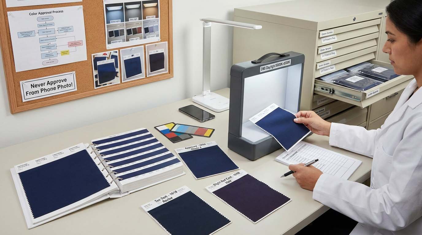
Pantone TCX: The Physical Standard
What Pantone TCX is:
Textile color reference system with 2,100+ standardized colors, each color has unique code (e.g., 19-4034 TPX = classic navy)
Why Pantone matters:
Universal language—factory in China, you in US, both looking at identical physical swatch
Eliminates interpretation—no describing "medium blue" and hoping factory understands
Enables consistency—reorders 6 months later use same Pantone code, achieving consistent color
How to use Pantone:
Purchase Pantone TPX swatchbook ($200-300)—one-time investment covering all future orders
Select desired colors from swatchbook, note Pantone codes
Provide codes to factory in tech pack
Factory dyes lab dips attempting to match specified Pantone
Pantone limitations:
Pantone is cotton standard—colors on polyester will not look identical to Pantone swatch
Pantone provides target, not guarantee—textile dyeing achieves "close match" within tolerance
Not all Pantone colors achievable on all fabrics—very bright or very light colors may have limitations
Lab Dip Approval Process
- You provide Pantone code (e.g., 19-4034 TPX navy)
- Factory dyes small fabric swatch attempting to match
- Factory sends lab dip to you
- You compare lab dip to Pantone swatch under controlled lighting
- You approve or request revision with specific feedback
How to evaluate lab dips:
Use natural daylight or daylight-equivalent lightbox (5000K-6500K color temperature)
Compare lab dip directly against Pantone swatch—do not rely on memory
Check under different lighting angles
Assess if difference is within acceptable tolerance (0.5-1 shade)
Approval language:
Good: "Approved—color matches Pantone 19-4034 within acceptable tolerance"
Needs revision: "Too dark by approximately 1-2 shades, please lighten"
Unacceptable: "Completely wrong color, does not resemble Pantone 19-4034"
Common lab dip mistakes:
Comparing lab dip to photo on phone instead of physical Pantone—photos are not accurate
Reviewing under fluorescent office lighting instead of natural daylight—lighting changes color appearance dramatically
Not documenting approved lab dip with photo and notes—no record of what was approved
Lightbox Check: Controlled Lighting Evaluation
What is a lightbox:
Standardized lighting environment (typically D65 daylight, TL84 cool white fluorescent, UV light) used for consistent color evaluation
Why lighting matters:
Same fabric looks different under daylight versus fluorescent versus incandescent
Color must be approved under lighting conditions matching end-use environment
Golf apparel primarily viewed in natural daylight—should be evaluated under daylight-equivalent lighting
Professional color evaluation:
Factories with professional color QC use lightbox for lab dip preparation and bulk production inspection
Brands serious about color consistency should evaluate samples under controlled lighting
Smartphone flashlight or office lighting creates inconsistent results
Practical approach for small brands:
Minimum: Evaluate all color decisions in natural daylight (near window, overcast daylight best)
Better: Purchase daylight-equivalent bulb (5000K-6500K) for consistent indoor evaluation
Best: Use portable lightbox ($150-400) for professional-level consistency
Golden Sample Retention
What is Golden Sample:
Approved pre-production sample retained by both brand and factory as physical reference for bulk production quality
Why Golden Sample is critical:
Bulk production color should match Golden Sample within specified tolerance
If color dispute arises, Golden Sample is definitive reference
Enables quality control during production and pre-shipment inspection
Golden Sample management:
Keep Golden Sample in protective storage away from light (colors fade with UV exposure)
Label with style name, color name, Pantone code, approval date
Take photos documenting color under consistent lighting
Retain duplicate—one for your records, one with factory
What happens without Golden Sample:
No objective reference for "what was approved"
Color disputes become subjective arguments
Bulk production rejection risks increase
What Color Tolerances Are Normal and How Do You Verify Production Consistency?
Color consistency expectations require understanding normal textile dyeing variance—typically 0.5-1 shade difference under controlled conditions—because expecting perfect identical match to sample creates unrealistic standard causing unnecessary production disputes and shipment rejections for variance that is industry-standard and unavoidable.
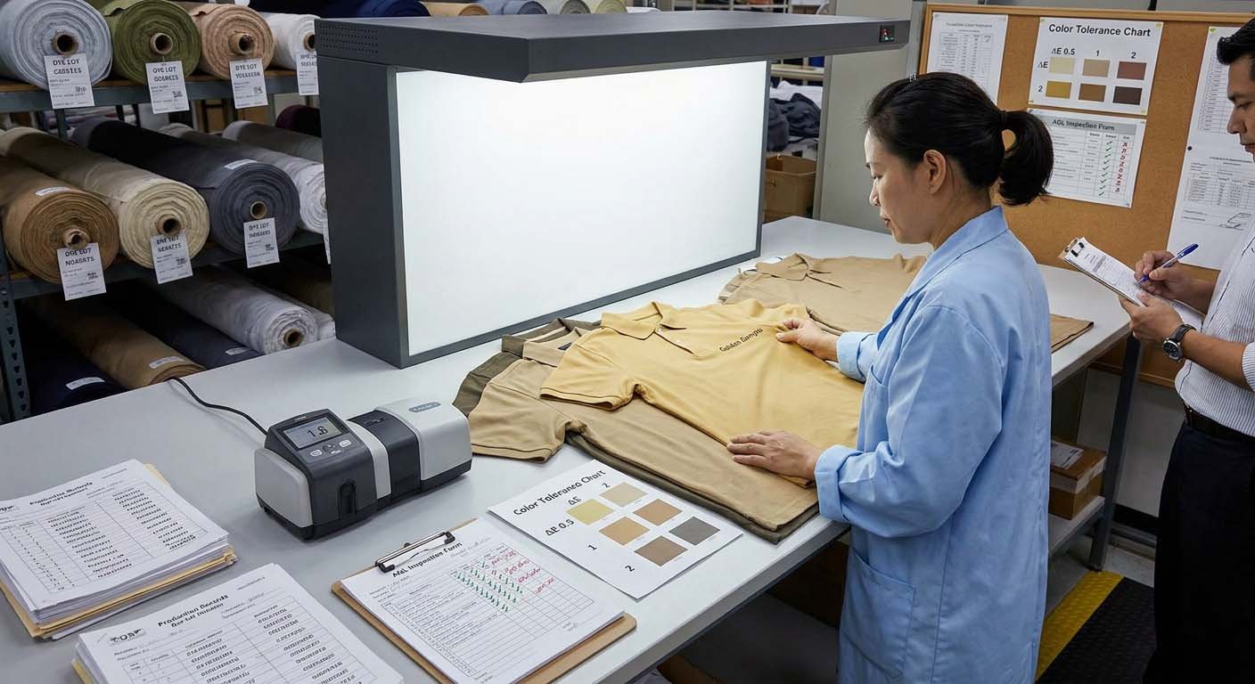
Industry Standard Color Tolerances
Delta E measurement:
Numerical measurement of color difference—lower number means closer match
Delta E 0-1.0: Imperceptible difference to average observer
Delta E 1.0-2.0: Barely perceptible, acceptable for most applications
Delta E 2.0-3.0: Noticeable but often acceptable for non-critical applications
Delta E 3.0+: Clearly different, typically unacceptable
Visual tolerance description:
0.5 shade difference: Requires side-by-side comparison under good lighting to notice
1 shade difference: Noticeable when directly comparing but acceptable in normal viewing
1.5-2 shade difference: Clearly lighter or darker, marginal acceptance depending on positioning
2+ shade difference: Obviously different, typically rejected
Acceptable tolerance ranges:
Premium positioning with strict color standards: Delta E ≤ 1.0 (0.5 shade)
Standard commercial production: Delta E ≤ 2.0 (0.5-1 shade)
Value positioning with looser standards: Delta E ≤ 3.0 (1-1.5 shade)
Dye Lot Variance Reality
What is a dye lot:
Single batch of fabric dyed together in one dyeing cycle—typically 500-2,000 yards
Why dye lot variance exists:
Temperature fluctuations during dyeing affect color uptake
Water chemistry variations (minerals, pH) affect dye results
Dye batch aging and raw material variations create subtle differences
Fabric construction variations affect dye absorption
Practical implications:
Fabric from different dye lots will have slight color variance (0.5-1 shade) even using identical dye formula
Cannot perfectly match colors across orders placed months apart—will be close but not identical
Mixing dye lots in same production run creates visible color variance within single order
Best practices:
Order sufficient fabric from single dye lot to complete bulk production
If reordering same style, new dye lot will be "close match" not "perfect match"
Do not expect perfect color consistency between orders placed 3-6 months apart
AQL Color Inspection Standards
AQL (Acceptable Quality Limit) for color:
Critical defects (completely wrong color): 0% acceptable
Major defects (outside tolerance range): 2.5% acceptable
Minor defects (within tolerance but borderline): 4.0% acceptable
What this means practically:
In 1,000-piece order with 2.5% major defect AQL:
Statistically expect 0-25 pieces outside color tolerance
Acceptable to have 10-20 pieces with slight color variance
Not acceptable to have 50+ pieces outside tolerance
Inspection sampling:
Pre-shipment inspection samples 10-15% of production (e.g., 50-100 pieces from 1,000-piece order)
Compares sampled pieces to Golden Sample under lightbox
Documents color consistency and defect rates
Approves shipment if defects within AQL limits
Reality check:
Textile production will have some color variance—zero defects is unrealistic goal
AQL standards define acceptable variance range protecting both factory and brand
What Justifies Production Rejection Versus Acceptance
Reject bulk production if:
Color clearly outside 2-shade tolerance (2+ shades lighter or darker than Golden Sample)
More than 5-10% of production outside tolerance range
Different dye lot used mid-production creating obvious color differences within order
Color does not match approved lab dip that served as production standard
Accept bulk production if:
Colors within 0.5-1 shade of Golden Sample (Delta E 1.0-2.0)
95%+ of production within tolerance range
Slight dye lot variance present but individual pieces still acceptable
Minor color inconsistencies that do not affect marketability
Grey area requiring negotiation:
Colors at 1.5 shade variance (Delta E 2.5-3.0)—marginally outside tolerance
5-10% of production outside tolerance—borderline AQL limit
Color acceptable in lightbox but looks off in natural daylight
How Do You Plan Color Releases That Balance Trend Appeal with Inventory Management?
Seasonal color strategy viability depends on matching new color introduction frequency to actual sales velocity and working capital capacity—because each new color creates inventory carrying costs requiring 6-12 months to sell through, making restrained introduction pace more profitable than aggressive launch calendars for emerging brands.
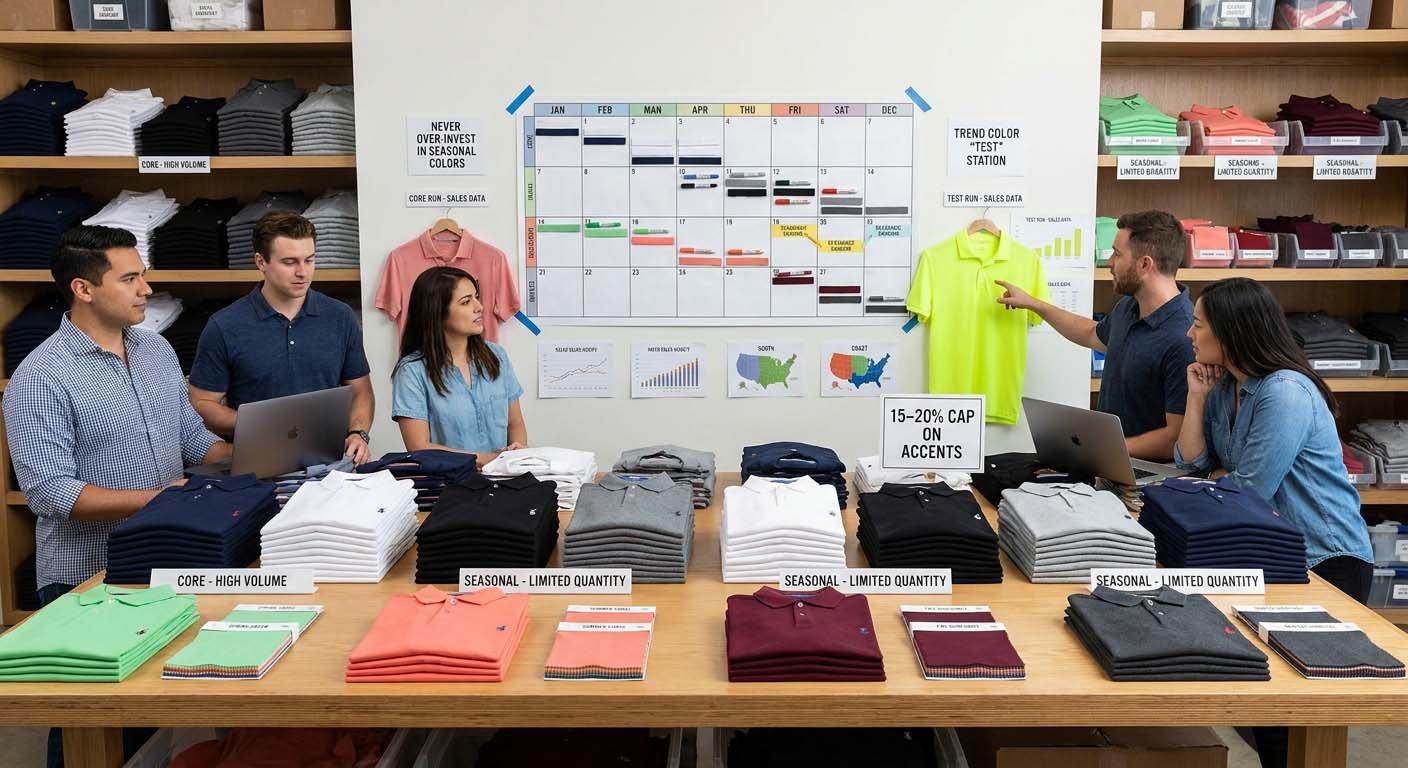
Core Color Year-Round Strategy
Purpose:
Provide consistent availability, fund business operations, minimize inventory risk
Recommended core colors:
2-3 colors for brands under $25,000 quarterly revenue
3-4 colors for brands at $25,000-75,000 quarterly revenue
4-6 colors for brands above $75,000 quarterly revenue
Typical core color choices:
Conservative positioning: Navy, charcoal, white
Active/athletic positioning: Black, navy, grey, royal blue
Heritage/traditional positioning: Navy, white, burgundy, forest green
Replenishment strategy:
Order deeper inventory (60-90 days supply)
Replenish every 4-8 weeks based on sell-through
Never discontinue—maintain consistency across seasons
Seasonal Accent Color Introduction
Purpose:
Create newness and brand storytelling without excessive inventory risk
Seasonal color themes (examples):
Spring: Lighter blues, soft greens, khaki
Summer: Bright whites, light greys, coral or turquoise accents
Fall: Burgundy, forest green, chocolate brown
Winter: Deep navy, charcoal, wine
Introduction strategy:
Introduce 1-2 new seasonal colors per quarter
Order shallow depth (150-250 pieces) testing market response
Promote heavily during introduction window (4-8 weeks)
Discount remaining inventory after season
Financial reality:
Seasonal colors will likely require markdown (15-30% off) to clear inventory
Acceptable as marketing expense generating brand interest
Do not exceed 15-20% of total inventory investment in seasonal colors
Regional Color Preferences
Regional patterns from order data:
Southern US / warm climates: Lighter colors preferred (white, light blue, khaki)—dark colors perceived as too hot
Northern US / cooler climates: Darker colors acceptable year-round (navy, black, charcoal)
Coastal regions: Blues and greens perform well—ocean/nature association
Southwest US: Earth tones strong (tan, burgundy, sage)
Practical implications:
If selling nationally: core palette must work across regions—neutral colors safest
If regionally focused: can skew palette toward regional preferences
If multi-channel: physical retail locations may need regional color adaptation, e-commerce can offer broader palette
Merchandising Calendar: Color Release Timing
Quarter 1 (Jan-Mar):
Core colors: Full availability
Seasonal introduction: Spring colors (late Feb/early Mar for Apr-Jun wear)
Production timing: Order Jan for Mar/Apr delivery
Quarter 2 (Apr-Jun):
Core colors: Replenish as needed
Seasonal introduction: Summer colors (early Apr for Jun-Aug wear)
Spring colors: Begin clearance if not sold through
Production timing: Order Apr for Jun/Jul delivery
Quarter 3 (Jul-Sep):
Core colors: Replenish as needed
Seasonal introduction: Fall colors (early Jul for Sep-Nov wear)
Summer colors: Aggressive clearance
Production timing: Order Jul for Sep/Oct delivery
Quarter 4 (Oct-Dec):
Core colors: Replenish as needed
Seasonal introduction: Winter/holiday colors (early Oct for Nov-Jan wear)
Fall colors: Begin clearance
Production timing: Order Oct for Dec/Jan delivery
Calendar reality:
4-6 week production lead time means planning 2-3 months ahead
Seasonal colors arrive mid-season, not beginning—acceptable as customers buy throughout season
Clearance timing critical—do not carry seasonal colors into next season
Trend Color Testing Strategy
How to test trend colors without excessive risk:
Limit test quantity: 150-200 pieces maximum
Select single trend color per season: not multiple simultaneously
Promote aggressively: social media, email, pro shop placement—give it best chance
Measure results objectively: did it sell 60%+ at full price within 8 weeks?
Make data-driven decision: reorder if successful, discontinue if not
Successful trend color indicators:
Sells 60-70%+ within 8 weeks at full price
Customers request restock
Social media engagement higher than core colors
Price resistance low—few discount requests
Failed trend color indicators:
Sells under 40% within 8 weeks
Requires discount promotion to move inventory
Customer feedback: "interesting but not for me"
Returns higher than core colors (color not matching expectations)
Conclusion
Golf apparel color selection aligned with brand identity requires filtering aesthetic preferences through three practical constraints—target customer demographics and color conservatism (with 60-70% of sales volume consistently going to navy, black, white, grey regardless of brand positioning), sales channel display conditions affecting color differentiation and photography needs, and supply chain realities of fabric availability, MOQ requirements per color (typically 200-500 pieces), dye lot variance creating 0.5-1 shade tolerance as industry standard, and seasonal release timing requiring 4-6 week production lead time planning—with commercially successful brands balancing 2-3 year-round core colors (representing 70% of inventory investment) against 1-2 rotating seasonal accent colors (shallow 150-250 piece depths testing market response) rather than launching broad color assortments that trap capital in slow-moving SKUs requiring markdowns to clear inventory.